Setup
By using Zenith, you consent to all terms of use. Full terms of use can be seen here.
React
Project Installation and setup
Zenith is distributed as an npm package on npmjs.com.
Go to the root of your project and run the following command:
npm install @geotab/zenith --saveImporting styles
Styles in Zenith library are located in the css file@geotab/zenith/dist/index.css, which should be included in your project. The following is an example of how to include them if your builder handles css imports:
import React, { useCallback, useMemo, useState } from "react"
import "@geotab/zenith/dist/index.css"
It can also be imported in your less/sass file.
Usage
If you have followed the installation process correctly, you can now import components from the package:
import React, { useCallback, useMemo, useState } from "react"
import { Menu, ButtonType, Button, IconSettings3 } from "@geotab/zenith";
Components are now ready for use
Available components
- Foundational element: Colors, icons, and font presets.
- Atomic components: Basic building blocks like buttons, checkboxes, and input fields.
- Higher-order components: Complex components such as headers, tables, and filter bars.
A complete list of available components and usage examples can be found in Storybook .
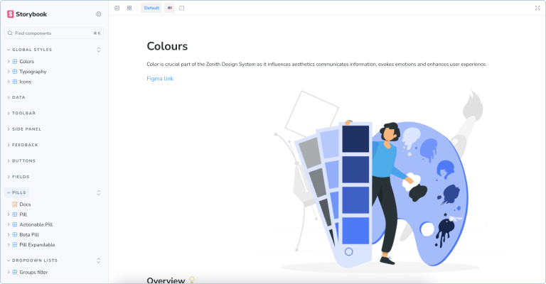
Colors
Zenith provides a defined color palette, where each color has a specific name, purpose, and value. This palette ensures consistency and accessibility across all applications. Colors are defined as CSS custom properties, offering flexibility and maintainability. They can be used within Zenith components and throughout any application for a unified style.
Explore the full color palette and usage guidelines in Storybook .
:root {
    // text
    --text-primary:                     #1F2833;
    --text-secondary:                   #4E677E;
    --text-placeholder:                 #8DA4B9;
    --text-hyperlink:                   #005AA8;
    --text-nav-highlight:               #0069BF;
    --text-error-message:               #C51A11;
    --text-button-disabled:             #C0CCD8;
    --text-reverse-primary:             #FFFFFF;
    --text-reverse-primary-button:      var(--text-reverse-primary);

    // backgrounds
    --backgrounds-main:                     #FFFFFF;
    --backgrounds-content-0:                #F9FAFB;
    --backgrounds-content-1:                #F2F5F7;
    --backgrounds-content-2:                #D9E1E8;
    --backgrounds-hover:                    #E6EBEF;
    --backgrounds-field-disabled:           #E6EBEF;
    --backgrounds-text-button-disabled:     #C0CCD8;
    --backgrounds-overlay:                  #rgba(31, 40, 51, 0.4);
    --backgrounds-primary-brand:            #25477B;
    --backgrounds-reverse-2:                #2F5B9D;
    --backgrounds-reverse-1:                #1F2833;
    --backgrounds-reverse-0:                #3E5265;

    ...
The following is an example of how Zenith colors can be used:
.zen-secondary-colors--active{
    color: var(--text-reverse-primary)
    fill:var(--text-reverse-primary);
    border-color: var(--action-secondary--hover);
    background-color: var(--action-secondary--hover);
}
Typography
Zenith defines typography presents for various use cases. These styles can be applied to your components, assigned class names to your HTML elements, or integrated into your classes (if you are using CSS-preprocessors such as less or sass.
Explore the full range of typography presets in Storybook.
return <>
    <div className="body-04">I'm body-04!</div>
</>;
Components are now ready for use.
Caption
- zen-caption — the parent element
- zen-caption__pre-content — the first element (usually an icon)
- zen-caption__content — the main content element (usually a text)
- zen-caption__post-content — an additional element at the end (usually an icon)
The most popular use case is "Icon + Text". It consists of the following CSS classes:
    return (
    <Button className="zen-caption">
        <IconCheck className="zen-caption__pre-content"></IconCheck>
        <span className="zen-caption__content">Approved</span>
    </Button>
    );

Link
- zen-link zen-link—disabled — disable the style of a link
- zen-link zen-link—inline — remove paddings/margins (This is useful when a link is embedded in text)
- zen-link zen-link—hidden — applies "display:none" and makes the link invisible
- zen-link zen-link—light — displays the link without an underline
return <a className="https://geotab.com" className ="zen-link">Link to website</a>UI components
Zenith provides a comprehensive set of UI components which can be combined like building blocks to create complex user interfaces. All components are fully independent and can be used in any combination. A full list of components can be found in Storybook.
Components should be imported from the npm package prior to use:
import React from "react";
import{
    Header,
    IconCheck,
    IconLoader,
    IListColumn,
    Menu,
    Pill,
    Table,
    useMobile
} from "@geotab/zenith";
Some components are not available in the index file of the npm package and must be imported directly from the file as below:
import { normalizeVertically } from "@geotab/zenith/dist/utils/positioningUtils/normalizeVertically";Containers
Zenith offers versatile container components like Card and Summary tiles. These provide features like titles, tooltips, and menus, while allowing you to customize the content within. For example, a Card can display anything from page summary information to line charts, all with consistent styling for borders, titles, and interactive elements.
User language and date format
Zenith includes components such as DateRange, which relies on date and time format. Use UserFormatProvider to wrap your application and set date formats as below:
Use the properties dateFormat and language to configure both date and time format and language in the current user object. FiltersBar.PeriodPicker will format dates according to your settings:
    return (
        <UserFormatProvider dateFormat="dd MMMM yyyy" timeFormat="hh:mm" weekStartsOnSunday={false}>
          <Header onFiltersBarOpen={() => setIsAllFiltersVisible(true)}>
            <Header.Title pageName="Page Name" />
            <FiltersBar isAllFiltersVisible={isAllFiltersVisible} ...>
              <FiltersBar.PeriodPicker id="dateRange" showInSidePanel ... />
            </FiltersBar>
          </Header>
        </UserFormatProvider>
    );
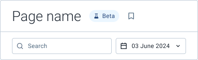
    return (
        <LanguageProvider language="ja">
          <Header>
            <Header.Title pageName="Page Name" isBeta={true} />
          </Header>
        </LanguageProvider>
    );

Zenith only provides translation for built-in strings. In the example above, only the beta pill will be translated by Zenith; Page name must be translated prior to using it in the component.
Troubleshooting
Please visit our Zenith community page or contact zenith@geotab.com if you have any questions or feedback.